
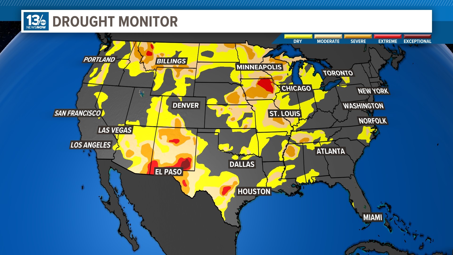
NORFOLK, Va. — You may have seen the U.S. Drought Monitor map before: splotches of yellow, orange, and red, showing areas of the United States that are in varying states of drought. But where does this information come from? And how often is it updated?
The U.S. Drought Monitor map is released every Thursday, showing where drought is and how bad it is across the United States. The map has five drought classifications or categories, ranging from normal and abnormally dry all the way up to extreme and exceptional drought.
The U.S. Drought Monitor is a team effort by the National Drought Mitigation Center at the University of Nebraska-Lincoln, the National Oceanic and Atmospheric Administration, and the U.S. Department of Agriculture.
Unlike most of the weather maps we use, the U.S. Drought Monitor is not a forecast; it looks back in time, providing a “snapshot” of very recent conditions.
Drought is a slow-moving hazard, so an area will still be in drought if it doesn’t receive rain. But it also may take more than one good rainfall to end a drought, especially if an area has been in drought for a long time.